Introduction
Australians now search and shop on their phones more than on desktops. Google’s mobile-first indexing means your mobile pages decide how you rank. Slow or incomplete mobile pages drive visitors away before conversions or rankings. This guide explains mobile-first indexing in plain language, highlights common mistakes and offers a simple process to keep your site competitive.
What Mobile-First Indexing Means (Without the Jargon)
Google crawls with a smartphone agent and uses the mobile version of your site for indexing and ranking. Desktop-only sites still get crawled, but they compete at a disadvantage. The easiest way to be mobile friendly is responsive design, where one URL adapts to any screen. Regardless of setup, keep your content and metadata consistent. A viewport meta tag tells browsers how to scale the page and signals to Google that it’s mobile friendly. Let Google access your content by using the same robots meta tags on mobile and desktop, not blocking CSS or JavaScript, and avoiding lazy-loading primary text and images.
Mobile UX Issues That Quietly Kill Rankings
- Slow loading: Heavy images and scripts make pages sluggish and users abandon them.
- Small tap targets: Buttons and links smaller than about 48 CSS pixels cause mis-taps. Follow official tap target guidelines.
- Intrusive pop-ups: Full-screen interstitials and blocking dialogs frustrate users and confuse search engines. Use discreet banners. Google’s intrusive interstitials guidance explains what to avoid.
- Unreadable layouts: Tiny fonts and fixed widths force zooming. Use fluid grids and relative sizing and ensure a valid viewport meta tag.
Content Parity: What Must Match Between Mobile and Desktop
Need help? Our SEO agency Sydney can audit your mobile site.
Because Google ranks the mobile version, keep your primary content the same on mobile and desktop. Don’t strip product details, headings or links from mobile pages; instead collapse them into tabs or accordions. Use identical titles, meta descriptions and structured data. High-quality images should share the same alt text. On m-dot sites, set the desktop URL as canonical and mark the mobile page as an alternate.
Technical Checks That Matter Most
- Robots and meta tags: Use the same robots meta tags on both versions, avoid noindex, and ensure robots.txt doesn’t block mobile resources.
- Don’t hide content: Make sure text and images load without requiring user interaction; avoid lazy-loading primary content.
- Structured data and metadata: Mirror markup, titles and descriptions on mobile and desktop and use correct URLs.
- Redirects: Redirect each desktop URL to its specific mobile counterpart rather than the home page.
- Viewport and tap targets: Include a valid viewport tag on every page and ensure buttons and links meet size and spacing guidelines.
A Repeatable Mobile QA Checklist
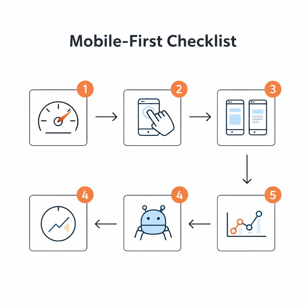
- Test mobile friendliness with Search Console or PageSpeed Insights and fix reported problems.
- Compare content: Verify headings, text and links match across mobile and desktop pages.
- Review UX basics: Check that fonts are legible, tap targets are large and there are no intrusive pop-ups.
- Verify technical tags: Confirm the viewport tag and robots rules are correct and structured data matches.

Conclusion / Next Steps
Mobile-first indexing is permanent. A poor mobile experience costs you leads and rankings. Understanding how mobile indexing works, fixing basic UX issues, maintaining content parity and auditing regularly protects your site’s visibility and revenue. To see real examples of mobile optimisation boosting results, explore our Case Studies. For tailored guidance or a mobile audit, Contact us today and our team will help you turn mobile visitors into customers.
FAQ
Is mobile-first indexing still relevant in 2025?
Yes. Almost all sites are indexed with a smartphone crawler.
You still need to maintain your mobile pages because Google continues to prioritise the mobile experience.
Does Google rank my mobile site or desktop site?
Google has one index based on your mobile pages.
Responsive sites serve the same HTML, but if your desktop pages have extra information, Google may not see it.
Keep content parity so nothing important is missing from mobile.
What is content parity and why does it matter?
Content parity means your mobile pages contain the same main information-headings, text, structured data and links-as your desktop pages.
Without parity, Google can’t access missing details, which may hurt relevance.
Parity also ensures users get a consistent experience.
Can pop-ups hurt mobile SEO?
Yes. Intrusive pop-ups and interstitials frustrate visitors and make it harder for Google to understand your content.
Use small banners instead of full-screen overlays and avoid redirects for consent or promotions.
How do I test mobile issues quickly?
Use Search Console’s Mobile Usability report and run PageSpeed Insights or Lighthouse audits.
These tools flag problems like missing viewport tags and small tap targets.
Browsing your site on actual phones helps catch layout or navigation issues.
What should I track after mobile fixes?
Monitor bounce rate, pages per session and conversion rate for mobile users.
Check Search Console for changes in mobile impressions and clicks and watch Core Web Vitals for loading, interactivity and stability improvements.
Conclusion / Next Steps
Local SEO isn’t a one‑off project; it’s a discipline that drives pipeline. By mastering relevance, proximity and prominence, optimising your GBP, building suburb pages, earning honest reviews and measuring what matters, you can dominate the map pack across Australia. To see our wins, check our Case Studies and Contact us to start.

