

You have 10 seconds. Build your website for them.
Most people decide whether to stay on a web page within about 10 seconds. On a phone, the window is even tighter.
That changes how a website should be planned, designed and built. A site built on a large desktop monitor in a fast office often fails on a phone, on a train, on a patchy 4G connection. The visitor doesn’t wait. They hit back.
This post covers what the data says about how long people stay, and then gets practical: what to consider when you build a page or a whole site so it wins those first 10 seconds.
How long do visitors actually stay?
The short answer: the first 10 seconds decide it, and mobile visits are much shorter than desktop ones.
Nielsen Norman Group analysed a Microsoft Research study of more than 2 billion page visits. The average visit lasted a little under a minute. The first 10 seconds were where people were most likely to leave. Visitors who stayed past about 30 seconds tended to stay for minutes.
Mobile has made that window tighter. Contentsquare’s 2026 benchmark covers 99 billion sessions:
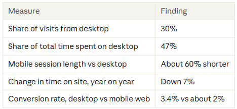
Mobile brings most of the visitors, but each visit is short. Shorter isn’t automatically worse, though. Mobile users usually arrive with a clear intent, and a quick visit that gets them what they came for is a good one.
What matters is whether the paShare of vige is built for that quick, focused visit.
What to consider when building your website
1. Design for the phone first, then scale up. Start wireframes at phone width. A layout designed for desktop and squeezed down usually pushes the important message below the fold. Designing small first makes you decide what matters most.
2. Make the first screen do the work. The top of the page on a phone is roughly the size of a business card. In that space, a visitor should be able to answer three questions without scrolling:
- What is this?
- Is it for me?
- What do I do next?
Use a plain headline that states the benefit, a single supporting line, and one clear call to action. Leave the clever taglines and brand stories further down the page.
3. Treat speed as part of the design. Google’s 2016 research found 53% of mobile visits were likely to be abandoned when a page took more than 3 seconds to load. Sites have got faster since then. Contentsquare now finds pages taking over 3 seconds affect just under 11% of sessions. But every second spent loading comes out of a visitor’s 10 seconds. In practice that means:
- Compress and correctly size images, and use modern formats such as WebP or AVIF
- Limit heavy sliders, autoplay video and large animation libraries above the fold
- Audit third-party scripts such as chat widgets, tracking pixels and pop-ups; each one adds load time
- Choose good hosting and a CDN, and test on a real mid-range phone, not just a fast office connection
- Monitor Core Web Vitals in Google Search Console
4. Match the page to where the visitor came from. One in three visits now starts deep in a site, often on a product page, rather than the homepage. Every page someone can land on needs to work as a front door. If an ad or search result promised something, the headline should echo it straight away so the visitor knows they’re in the right place.
5. Build for thumbs. Put primary buttons where a thumb can reach them, make tap targets large enough to hit easily, and consider a sticky call-to-action bar on longer pages. Keep forms short, use the right keyboard for each field (numbers for phone, email for email), and allow autofill.
6. Write for scanning, not reading. Mobile visitors skim. Use short paragraphs, descriptive subheadings, bullet points and bold key phrases. Front-load each section with its main point so someone scrolling quickly still gets the message.
7. Reduce interruptions. Cookie banners, newsletter pop-ups and chat bubbles can cover most of a phone screen. Stacked together, they can take up the whole first 10 seconds. Delay pop-ups, keep banners compact and never block the main message on arrival.
8. Show trust early. A star rating, a recognisable client logo or a short testimonial near the top reassures new visitors quickly. Desktop visitors may go looking for proof; mobile visitors rarely will.
9. Measure mobile and desktop separately. A blended average hides the real story. In GA4, compare engagement time, scroll depth and conversion rate by device. Use heatmaps or session recordings to see where mobile visitors stop. A page that performs well on desktop may be quietly failing on phones.
The 10-second checklist
Before any page goes live, open it on a phone and check:
√ The page loads in under 3 seconds on a 4G connection
√ The headline says what you offer and who it’s for
√ The main call to action is visible without scrolling
√ Nothing (pop-up, cookie banner, chat bubble) covers the main message on arrival
√ Buttons are easy to tap with a thumb
√ At least one trust signal appears in the first two screens
√ The headline matches the ad or search result that brought the visitor here
√ Forms ask only for what you need and support autofill
√ Analytics report mobile and desktop separately
The bottom line
You don’t need visitors to stay longer. You need them to decide quickly that they’re in the right place.
Build for the phone first, make the first screen count, keep pages fast and measure mobile on its own. Do that and your 10 seconds turn into minutes, and into enquiries.
Not sure how your site performs on mobile? Get in touch for a quick review of your key landing pages.
Sources
- How Long Do Users Stay on Web Pages?, Nielsen Norman Group, 2011 (Microsoft Research data, 2010)
- 15 mobile analytics stats from the 2026 benchmark report, Contentsquare
- 2026 Digital Experience Benchmark, Contentsquare
- The need for mobile speed, Google, 2016